Johns Hopkins versus Florence Nightingale
As everyone keeps saying. “We are living in unprecedented times”. Certainly, in our lifetimes this can be said to be true, but if history tells us anything it is that it has a habit of repeating itself.
It is therefore interesting to analyse how we have tracked the current pandemic with all of the latest data and visualization tools at our disposal. If data is the new oil (a tedious and misleading motif of the naughties) then surely we should be better informed on the path Covid 19 is taking. Yet all we see around us is confusion and uncertainty on where we stand now and what is coming round the corner in this ongoing crisis. Politicians and scientists are at loggerheads whilst the growing “conspiracy theorists” are feeding heavily on fake and misleading news coming at us from every direction 24 hours a day.
One thing is certain is that at no other time have the general public on mass been so hungry for statistical tools to show us were we are with Covid 19 and more importantly when we can get back to normality. The Johns Hopkins Covid dashboard has broken all records in popularity and is firmly the most successful BI dashboard in history in usage terms. Yet in my mind I keep coming back to the little-known inventor of the pie graph Florence Nightingale and how she managed to convince the war office in 1858 to release funding to treat casualties during the Crimea war. Below is a what might seem a spurious comparison on both visualisations. Whilst there are a lot of other Covid 19 dashboards out there such as the Google Coronavirus map and WHO’s Dashboard tracker. Comparisons for these are for another day.
Although there are obvious differences in the motive for the 2 visualisations, one being a pandemic and the other a War (the obvious comparison would be with the Spanish flu). Essentially both are working off a basic business question (the business in question being Health) The Covid dashboard is tracking number of cases and Nightingales pie chart shows the number of casualties who if effectively treated would be able to return to the front.

For me there are a lot of holes in the Johns Hopkins product. It certainly has an aesthetic feel and the interaction through the dashboard is dynamic, but I come away from it with more questions than I have answers. We can see major issues with data quality throughout and it is certainly US centric. If anything, it tells me where countries stand on effective testing rather than tracking effective treatment or the impact of lockdowns and social distancing rules.
The default starting point is the Global map. The homepage shows a nice map of the world which was useful when the pandemic was in its early stages and we could see the spread from China to the rest of the world, but now that it is worldwide it merely shows the geography. A real miss is when I click on a country the main visual of the global map remains, it would be great if the heat map used for the US map tab was available for all other countries and would change to this in the central visualisation. Obviously, not all data is included. For example, in France we just see the total for the country, and we are not able to drill down into regions. We know the data is available but for some reason it is only included for a handful of countries.
The main KPI used in the dashboard is number of cases, this tells us little or nothing in itself. We can clearly see the total number of cases against those recovered and the number of deaths. What we cannot drill into is the gap. For example, currently as of 21st October 2020 the UK has reported 765,487 cases of which 2,626 have recovered and 44,057 have sadly died. This leaves 716,804 marked as active cases – for me it is not clear. What I want to know is how many are still being treated in hospital (a key driver in imposing lockdowns).
The other main competing dashboards from Google and WHO centre on the number of cases per 1000 people, a much more meaningful measure. A KPI that was incidentally used when reporting on the Spanish Flu 112 years ago.
The most useful section is certainly the Critical trends tab which takes us to a number of visualisations showing cases per 100,000. Also included is the impact of social distancing restrictions at state level. This is where I spend most of my time but as it is US centric, I go to other dashboards to see what is happening in other areas of the world.
Not that much has changed in 112 years. The tracking during the Spanish Flu pandemic used the same basic parameters including deaths per 1000 people.
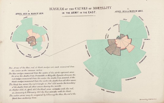
Nightingales polar area diagram
The polar area diagram was invented by Florence Nightingale to dramatize the extent of needless deaths in British military hospitals during the Crimean War (1954-56). The area of each coloured wedge, measured from the centre, is proportional to the statistic being represented. Blue wedges represent deaths from “preventable or mitigable zymotic” diseases (contagious diseases such as cholera and typhus, pink wedges deaths from wounds and Gray wedges deaths from all other causes. Mortality peaked in January 1855 when 2761 died of contagious diseases, 83 of wounds and 324 of other causes. Based on the army’s average strength of 32393, Nightingale computed an annual mortality rate of 1174 per 1000.
Diagram from Bernard Cohen, “Florence Nightingale,” Scientific American, March 1984. Originally from Nightingale’s book Notes on Matters Affecting the Health, Efficiency and Hospital Administration of the British Army, published in 1858.
Known as the rose diagram but commonly called ‘coxcomb’, this graph, which resembles a pie chart, was designed by Nightingale with the help of William Farr. It highlights the number of unnecessary deaths during the Crimean War as a result of preventable infections. It has become Nightingale’s most well-known statistical illustration. The beauty and simplicity of this graphic is clear to see. There is no confusion here.
Conclusion
Although 162 years separate the two it is interesting to note that the same challenges existed for both. Namely how to interpret large data sets to get a meaningful and instructive set of conclusions that can influence decision makers. There are obvious big differences between the two. Johns Hopkins are pulling a lot of information into one dashboard whereas Nightingales rose is a one stop shop statistical analysis. Which one is the most effective is open to debate but clearly Nightingales rose diagram was proven to change the minds of the British war office and actually saved lives in the long run. Whilst the success of the Johns Hopkins Dashboard is yet to be proven other than in terms of popularity.
Follow My Blog
Get new content delivered directly to your inbox.
